1
2
3


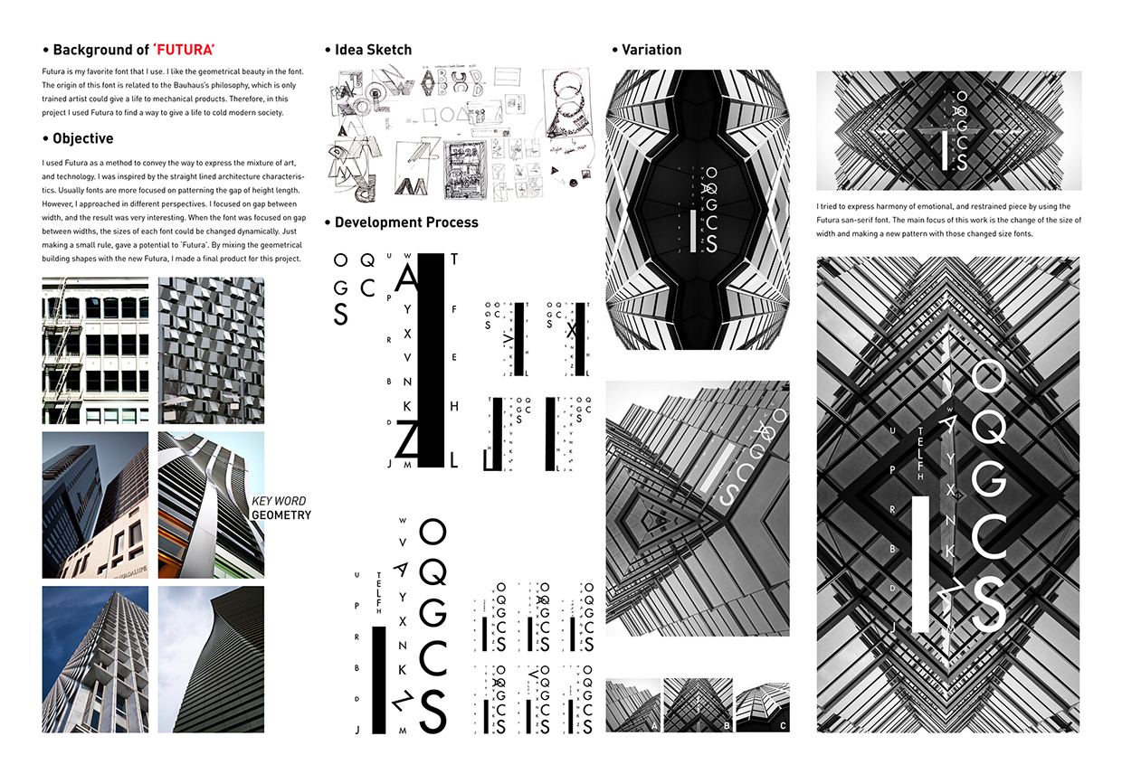
Futura-rchitecture is based on geometrical beauty in the font. The origin of this font is related to the Bauhaus’s philosophy, which is only trained artist could give a life to mechanical products. Therefore, in this project I used Futura to find a way to give a life to cold modern society.
I used Futura as a method to convey the way to express the mixture of art, and technology. I was inspired by the straight lined architecture characteristics. Usually fonts are more focused on patterning the gap of height length. However, I approached in different perspectives. I focused on gap between width, and the result was very interesting. When the font was focused on gap between widths, the sizes of each font could be changed dynamically. Just making a small rule, gave a potential to ‘Futura’. By mixing the geometrical building shapes with the new Futura, I made a final product for this project.
I tried to express harmony of emotional, and restrained piece by using the Futura san-serif font. The main focus of this work is the change of the size of width and making a new pattern with those changed size fonts.