1
2
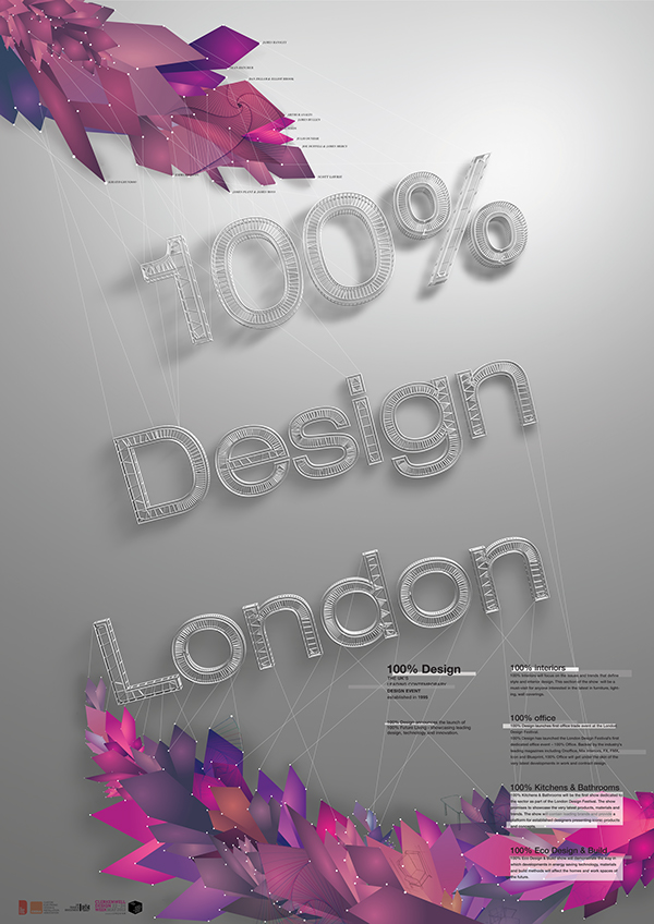
While I was designing, I focused on two things, one is interior design, and other is designers. I tried to visualize the gatherings of various designers with interior space in the poster. I brought the concept of dot, line, and face. Every design starts with dot, line, and face. Simultaneously, the year I was working on was the year 2012 which England was hosting the Olympic. I wished to make a connection between these two festivals. Fortunately, in 2012 Olympic logo there was also geometric patterns. Therefore, I developed those geometric shapes more to design the final poster for ‘2012 100% Design’.
The main logotype in the title was to convey the concept of straight lines in interior elements. The structured title is the meaning of interior works that are done by designers. All the lines, and dots are designers in the festivals. Therefore, the poster is conveying the message of the designers and their works makes ‘100% Design’.